Checkerboard Documentation
Click a link to move down to that section:
Introduction
Checkerboard Framework is a simple, grid-based SASS/CSS framework highlighting content with alternating-color cards. The framework allows interspersement of normal column content with the cards. To use Checkerboard Framework, either download the SASS files on the Download page or simply copy the header LINK line on the download page and add that line to each of your html documents.
SASS users have complete control to manipulate the final CSS, including the dynamic color-scheme template. Checkerboard Framework's color scheme script is configured to automagically compute the best contrasting and complementing colors for your site, based on a single numerical (color wheel number) input. This is possible due to the great work of Natalya Shelburne's SASS formulas (check out her page here - Practical Color Theory for People Who Code).
Layout
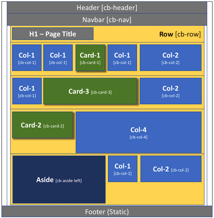
Checkerboard Framework is built on a basic 6-column grid system. Here are the finer points of the grid system:
- The entire page (minus the header/navbar and footer) is contained in a single "wrapper"
- The wrapper contains numerous ROWS (lateral across the entire page) - 90% width
- The grid is broken into 6-columns - the height of the entire row will be the height of your tallest column/card
- Columns/Cards have an identified width of 1, 2, 3, 4, 5, or 6-columns wide
- The row can handle UP TO and INCLUDING 6-columns-wide total (2 + 4 or 1 + 1 + 1 + 3, etc)
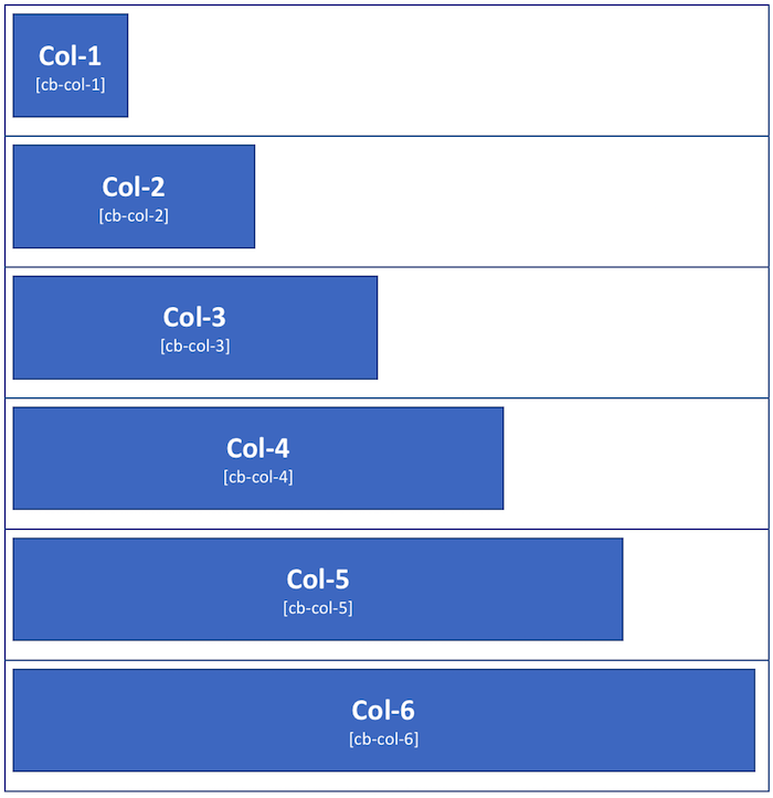
Columns
Columns are flexible-width as a percentage of the total page width. As a responsive grid-system, the width of the columns will grow and shrink with the stretching or contracting of the width of the browser window. On mobile devices, the entire page - including the columns - will automatically scale to an appropriate width.
Column height is initially static - at a minimum of 14 em's (meaning, the height of 14 lines of text, with the text being a standard 16px tall. The column will automatically grow taller with more content, but the width will stay the same.
Columns have NO background - the content will rest directly on the background image or color, unless specific action is taken to fill the column container. The content will still be bound by the column size. Each column has a 2% margin to the left. Containers that span more than one column include this 2% margin -- so, a cb-col-2 is NOT twice the size of a cb-col-1 ... it is twice the size plus the 2% margin size.
Here are the column widths available in this framework (along with the css class to invoke that width):
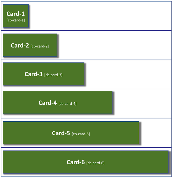
Cards
Cards are flexible-width as a percentage of the total page width, just like columns. However, cards stand-out on the page due to the background color and box shadow - adding a three dimensional look to the container. On mobile devices, the entire page - including the cards - will automatically scale to an appropriate width.
Like column height, card height is initially static - it is also at a minimum of 14 em's (meaning, the height of 14 lines of text, with the text being a standard 16px tall. The card will automatically grow taller with more content, but the width will stay the same.
Unlike columns, cards have a background color and drop-shadow. The content will be bound by the card size. Each card has a 2% margin to the left. Cards that span more than one column include this 2% margin -- so, a cb-card-2 is NOT twice the size of a cb-card-1 ... it is twice the size plus the 2% margin size.
Here are the card widths available in this framework (along with the css class to invoke that width):
Color
The color scheme for Checkerboard Framework is incredibly easy to manipulate, yet very powerful. Thanks to the fantastic work on color theory and coding from Natalya Shelburne's SASS formulas (check out her page here - Practical Color Theory for People Who Code) - there is only one number in the SASS files that needs to be changed in order to change the entire color scheme - complete with automatically calculated complentary and contrasting colors based on Natalya's work (yay science!).
To manipulate the color, download the SASS files from the DOWNLOAD page and open the _variables.scss file.
Choose your main theme color (at a site like HSL Picker - by Brandon Mathis) - be sure to get the HSL value (0-360), which represents the color on the color wheel. There may be some other numbers after the first one in the HSLA value. The 2nd number represents color saturation, the 3rd is for how much white (lightness) is in the color (making it darker and lighter), and the 4th is for transparency. In an HSL, there will be only three numbers...transparency comes into play for HSLA values.
In _variables.scss, set your HSL numbers for your BASE color. Your primary color will be a derivative of that color mixed slightly with that color's exact complement (other side of the color wheel). The 15% mix of the complement color goes a long way in making the two colors work better together. You do not need to change anything except the first number in the HSL value. Everything else will calculate out for you and set color-one, color-two, color-background, and color-accent.
Use "color-one" for the primary color, "color-two" for the secondary color, and "color-accent" for the accent color.
Buttons
The current version of Checkerboard Framework currently contains three different button styles and three button sizes.
| Button Styles | |
| Red Button cb-button-red | |
| Green Button cb-button-green | |
| Blue Button cb-button-blue | |
| Button Sizes | |
| Normal button | |
| Large button cb-button-large | |
| XL button cb-button-xl | |
Media Breakpoints
The Checkerboard Framework contains two media breaks - 480px and 768px. This means that the typography and pretty much everything else will automatically scale in size if/when the browser window is shrunk or expanded past one of those points. These numbers are easy to change to adapt to your specific needs - you can access the media breakpoints in the checkerboard.scss file (must of course download the package first).